
Mention “Stranger Things”, “House of Cards” or (for the Korean drama fans) “Kingdom” to a group of your friends, and you’ll likely receive at least a nod of acknowledgment or two. But beyond these originals (amongst others) that Netflix is well known for, the leading entertainment site is also a prime example of user interface and user experience design done well. In this article, we’ll use Netflix’s mobile site and website as a case study to discuss several features that make it one of the websites with the best user experiences.
So how does Netflix do it?
1. User onboarding UX
Netflix’s User Experience
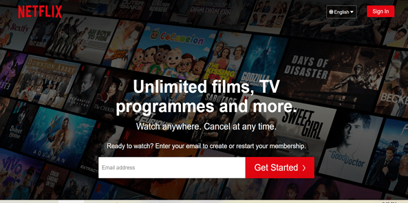
The site affords one of the best user onboarding experiences. The homepage is uncluttered with a clear call-to-action – to enter your email address to start watching. They also clearly state their unique selling point: ‘Unlimited films, TV programmes and more. Watch anywhere. Cancel at any time.’ This gives the user a crystal-clear understanding of the value proposition that the site has to offer.
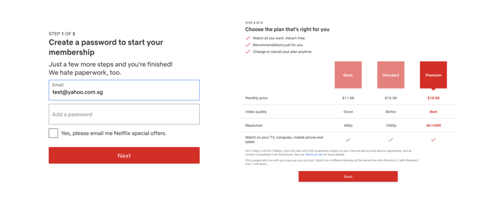
First two steps of signing up for Netflix. Source: Netflix
After inputting your email, the next steps are entering your password, choosing your intended payment plan, and setting up a payment method. In each of the pages, the designers have added progress markers, indicated by “Step 1 of 3” or “Step 2 of 3” as part of the signup process. These markers – along with the simplification of the overall process also serve to motivate the user, as it shows that there are only a few stages before registration is complete.
2. Landing page & navigational UX
After creating an account, Netflix would prompt you to pick films or series that you would like to view. The information is then used by the company to provide other personalised recommendations in the future, and this is further refined as you watch more shows.
The first thing you would note on the landing page is a featured video trailer of either a popular film or series, if not something from your saved list. The main call-to-action here is “play” (which is also common to the individual film/series page), but upon scrolling down, you can immediately see your saved series/films, new releases, productions that are trending now, and so on. These categories are very clearly demarcated so that it is easy for the user to navigate.
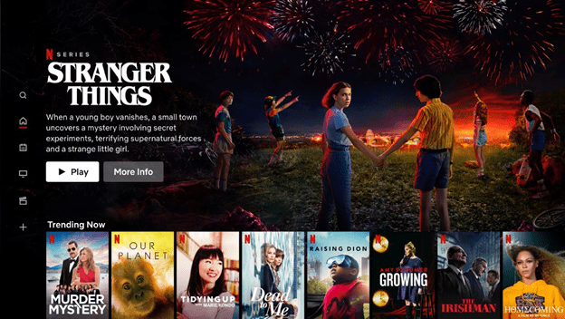
Netflix’s landing page. Source: Netflix
Additionally, some of the categories are indicated in the tabs at the top of the screen – such as “TV Shows”, “Movies”, “New & Popular”, “My List” and “Watch Again”. This is a prime example of intuitive user experience, as it makes it easy for the user to peruse through their offerings. Otherwise, they could also use the search key to look for the desired show. Netflix even has a “Kids” and “DVD” section, to appeal to various other user demographics.
For the various offerings on Netflix’s site, they also have an autoplay function, which functions as a “mini-trailer” that could help the user decide if they wish to save the show to their list, watch it or if it simply isn’t for them. While this is a very helpful function, they have also remained cognisant that others may not appreciate this after some time, hence there is also an option to disable these previews.
In each sub-page for different shows, users can scroll down to see the episodes list (or choose their preferred season, if applicable). Otherwise, there are also options to find similar types of shows, which would are quite likely to appeal to users, and inadvertently increase viewership.
3. Well-designed UI
Netflix also features good user interface design principles, such as:
- The use of a consistent colour scheme (black, red, and white) and fonts across all their pages
- Presence of clear and intuitive navigation
- Easy browsing through different titles in the site via thumbnails
- Presence of detailed information such as a summary, episode list, trailers, and a recommendations tab for each title under individual thumbnails
- Useful call to actions and colours (eg. red for Play) to guide the user
These all help to guide the user through the process of navigating the site, and helps to hence reduce the cognitive overload (from the presence of so much information and titles) for a better user experience.
4. Mobile user experience
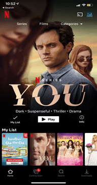
Netflix has also carefully designed their mobile UX such that navigational features can easily fit into your phone screen. Here, the categories on the top have been compressed into “Series”, “Films” and “Categories”, where the latter has a drop-down bar that could be used for browsing the different types of shows. Similarly, the “play” button here is indicated clearly in white (juxtaposed against black font) to draw the user’s attention to it first.
Source: Netflix App
At the bottom of the screen, other functionalities such as “coming soon”, “search” or “downloads” are arranged neatly so that they are easily accessible. This is different from the desktop version, which is aligned at the side of the screen. In the mobile version, these icons are arranged at the bottom so as to prevent crowding of the phone screen – otherwise, the icons would either be very small or distract the user from the main landing page.
5. Netflix’s UX process
To achieve its status as one of the best user experience websites, Netflix product designers have worked extensively behind the scenes. This site has outlined some of the processes behind the product, including carrying out A/B testing, which is a very important part of their process to get users to test out the customer experience.
Firstly, there would be a specific hypothesis that they would be testing. Then, a random sample of their members would be taken, and this group of people would be randomly assigned into two groups. Group A would be the “control group”, while B would be the “treatment group” i.e they would be subjected to the new experience highlighted in the hypothesis.
Prior to the experiment, metrics specific to the hypothesis would have been developed. These metrics could include time taken for the app to load, quality of video provided, or even relevant results in their searches. After the experiment, these metrics are then compared and used to evaluate the attractiveness of the new feature.
Sometimes, these metrics could be deceiving – while we attempt to establish causality, it may not always be possible, since there could be other factors outside our control. Hence, secondary metrics could also be used as a safeguard when attempting to link a consequence and a new product feature together. Netflix has also implemented “guardrail” metrics, which they use to limit downside consequences – an example of this could be the customer service contact rates in Groups A and B.
6. Personalisation
With over 15,000 titles and 200 million users on Netflix, personalisation on the platform becomes all the more important to differentiate themselves from traditional media offerings. The company has dived into exploring the use of personalised visuals for their shows to better cater to the genre the user is interested in. For example, a user that frequently watches action movies will be presented with a more action-oriented thumbnail for the film. Be sure to check out this article for a detailed breakdown into how Netflix uses artwork personalisation as part of their UX strategy.
Conclusion
Netflix has commonly been cited as one of the websites with the best user experience around. Hopefully, this article has shed some light on the features which make it such a great example, and it could be something worth drawing inspiration from when creating your own product or site!
We also hope that this article has provided you with a better insight into how a successful organisation like Netflix uses UX to increases its user engagement and retention. If you want to know more about user experience and its industry, do check out our other resources available on our websites, such as our articles, weekly webinars, and podcasts.
CuriousCore offers both a 2-day UX Design Course and a 4-month UX Career Accelerator for those keen on transitioning into the industry and working on real client projects. Click the buttons below to find out more.