With increasing numbers of internet-savvy users today, many businesses and individuals are moving online – be it to market a business or showcase a portfolio, having an online presence designed with the Website UX Best Practices is not just a nice-to-have, but a necessity to stay relevant. A poorly-designed site is more likely to hurt than help you. For instance, did you realise that the average visitor to your site takes just 0.05 seconds to form a first impression? Thus, what they see in these 50 milliseconds will determine if they will stay or leave, and a badly designed website could lead to you missing out on a significant user base or leaving a negative impression on a potential client.

Which would you be more likely to continue engaging with?
Sources — Left: The world’s worst website , Right: Airbnb’s landing page
Hence, you’ll want to stand out amongst the thousands of entries – in a positive way. But what exactly differentiates websites with great UX from those that don’t? Today, we’ll highlight some UX design process best practices using examples of some of the best user experience websites, and naturally, we will briefly touch on some e-commerce UX features and UI design best practices too.
Aspects of Website UX Design
A. Landing Page UX Best Practices
Your landing page is the first thing visitors will see when visiting your site. Hence, having an attractive user interface design is quite important to retain the attention of visitors.
Additionally, the main role of a landing page is for users to understand exactly what the purpose of the site is. Hence, there should be a clear call to action or purpose, with recognizable links or buttons which can help to convert these visitors to leads. As such, simplicity is key to reduce distractions and capture your users’ attention more easily.
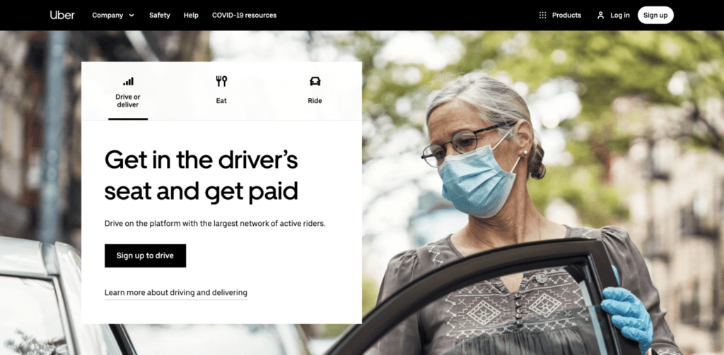
Uber’s homepage
Here, Uber is a great example of a site with an attractive, simple design with a clear call to action (CTA): Get in the driver’s seat and get paid. Furthermore, the platform has clearly segmented its target demographics based on their intended engagement with the service, through the tabs “drive or driver”, “eat” or “ride”. The “sign up to drive” button is also highlighted in black and when juxtaposed against a light background, draws any potential user’s attention to it instantly.
B. Search UX Best Practices
Another very important feature of your website is the search function. This is especially so for sites containing large amounts of information, such as online shopping sites or hotel bookings which tend to have many listings. Yet, while hoping to search for a specific item quickly, users also expect smooth transitions and an enjoyable user experience.
Hence, when designing your search UX, there are two key areas to focus on: the search box design and the search result page. For sites focusing on e-commerce or bookings as mentioned above, search boxes should be displayed prominently on the landing page. For instance, in the picture below, the search buttons are located right at the top of the page. Furthermore, there are clear prompts for each of the buttons such as “where are you going” and “add dates” to clarify the header, so that the user’s search is further simplified.
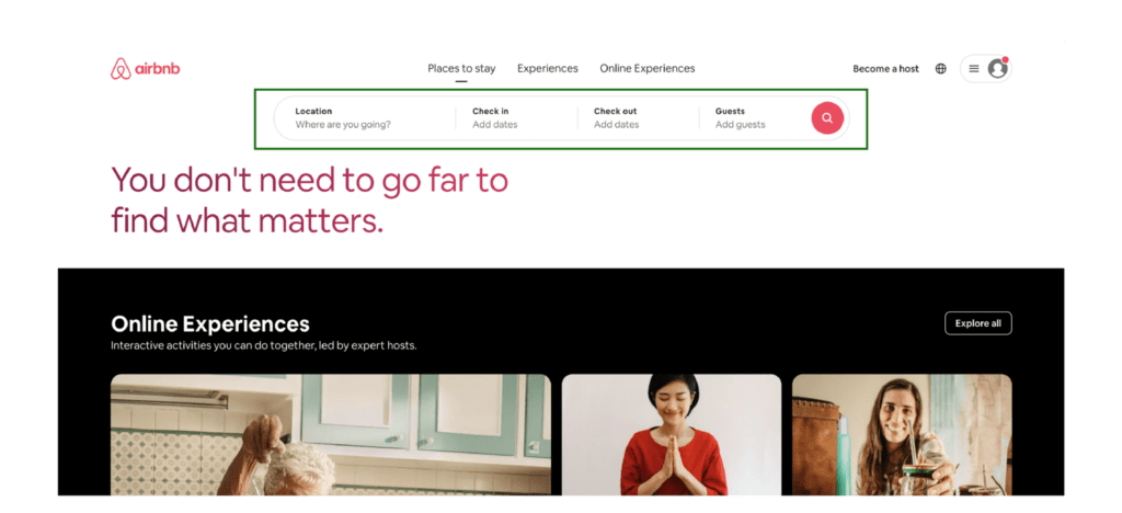
Airbnb’s landing page
Meanwhile, search results should have a clear layout and display of the number of matching results. On H&M’s site, products are laid out in a grid format, which helps visitors easily scan through clothing and their details. The grid view is often used for clothing since consumers often make split-second decisions based on appearance alone. Hence, it is more user-friendly than scrolling through a long list of potential apparel choices. However, list views could be more useful for items such as electronics, where specifications are more important to the user when weighing different choices.
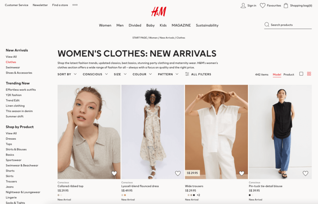
H&M’s product display
Additionally, showing users the number of items that match their search queries is often a good practice, as it allows them to make a decision as to whether they wish to further filter their search depending on the number of relevant results. Hence, providing options such as ‘filter’ and ‘sort’ at the top of the results display is also another part of e-commerce UX best practices. Typical filter options would include colour, size, or price. Sort options could include from ‘by lowest to highest price’, ‘by relevance’ or ‘newest’.
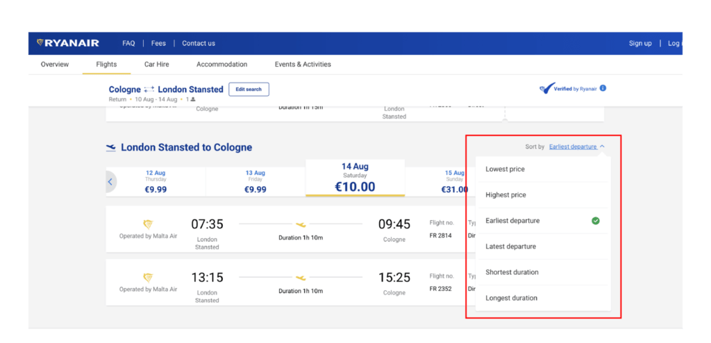
The first two sort options for Ryanair flights are by ‘lowest price’ and ‘highest price’
However, the exact order would best be determined by your users, and factors they prioritise. For instance, for budget airlines such as Ryanair, sorting by price appears on the top, since most visitors are looking for the cheapest deals on the site.
C. Checkout UX Best Practices
After your visitor has decided on their purchases, the next step would be for them to check out their items. Investp has carried out an insightful study on the main reasons why consumers would abandon their items in (virtual) shopping carts. Key reasons related to UX design include the lack of a guest checkout option, needing too much information, and complex checkout processes.
Typically, checkout options are characterized by a cart or bag logo and are normally located on the top right-hand side of the screen. In Amazon’s website, they have also indicated the number of items that have been selected, and there is a clear CTA via the yellow button as to how to access the cart.

Amazon’s product listing page
Yet, Amazon doesn’t offer guest checkout services, hence users need to create an account to purchase their items. In contrast, while Sephora’s provides benefits for registered users via their ‘Beauty Pass rewards’ indicated on the screen, visitors are free to purchase their items without going through a registration process. Additionally, the site clearly indicates the various payment types that the platform also accepts.

Sephora’s first checkout page
On the second and final checkout page, Sephora also simplifies the process by showing all the required steps to complete the order, such as ‘shipping address’, ‘shipping method’ and ‘payment methods’ all in one page, which clearly indicates to the user their progress in the checkout journey. Another popular method is to use various pages for each stage and track the user’s progress via a bar at the top of the screen.

Sephora’s final checkout page
Other ways to simplify the checkout process could include adding a checkbox to indicate that your billing address is the same as your home address or including an auto-fill function for addresses based on postal code.
D. Mobile UX Design Best Practices
Given the ubiquity of portable devices today, many users may also be accessing your site via their smartphones or tablets. Thus, not having a mobile version of your website is best avoided. Otherwise, your website will look exactly the same on your desktop as it does on your phone… but the latter will be much smaller, which can be an instant turnoff for potential leads!
When designing for mobile, there are certain key differences that should be taken into account, including:
- Size of screen
- Screen orientation and accessibility
- Navigation and input
In general, desktop screens are able to fit more information within one page since they tend to be much bigger than your phone screen. Hence, when designing your mobile UX, only key information should be kept, otherwise, the page would end up becoming absurdly long. One good example of this is Suzanne Collins’s books. While the site is full of positive reviews for her books, in the mobile version, it looks clunky and site visitors have to scroll past at least 15 reviews before they can get to the “about” section and “selected works” for showcase. This could lead to reduced user conversion due to impatience. Additionally, font sizes for mobile versions should also be sized up appropriately to avoid needing to squint at the screen.
On-screen orientation, desktop versions tend to be horizontally oriented, but mobile devices allow users to use horizontal or vertical formats. Thus, this is an important point to consider in mobile UX design. Different features should also be easily accessible so that users do not need to hunt for them, such as their wishlist items or search functions.
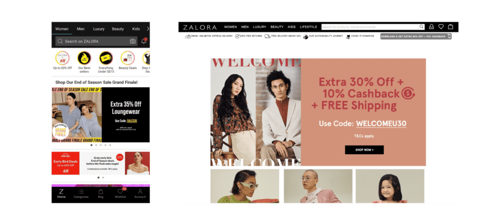
Zalora’s app and desktop landing pages
Lastly, most modern phones typically do not have a physical keypad. Hence, when inputting numbers or text, an on-screen keyboard should be furnished. However, to simplify the input and navigation process, it is preferable to adjust the keyboard to the input required. For instance, postal codes may not require any alphabets, hence a simple numerical keyboard would be much more functional than an alpha-numerical one. In Zalora’s app, the navigation buttons are also indicated clearly by the use of icons, and the design is much more compact than the desktop version.
E. User Interface Best Practices
Lastly, the key to a good website is also having a great user interface. Some important points would include picking a colour scheme and style which is coherent with your brand and using adequate whitespace to prevent overcrowding of the page. In fact, consistency in design styles and colour choices for your desktop and mobile versions is integral to further boost credibility and reinforce users’ impressions of your brand. Using short but punchy sentences can also help to retain the main messages that you intend to bring across about your brand, service, or product.
Additionally, we often understand concepts better through visual aids such as images. Whether they are static or even dynamic, this could be a useful addition to your website to explain complicated concepts. However, be sure to pick high-quality pictures if you intend to use images!
Conclusion
Hopefully, this article has given you a clearer understanding of what differentiates the best UX websites, and how you can go about crafting your site! Of course, to ensure that your website is up to par, web usability testing could be useful for your site to garner some user feedback to understand if your website’s UX is up to par. If you want to know more about user experience and its industry, do check out our other resources available on our websites, such as our articles, weekly webinars, and podcasts.

