Schedule a call
-

Mobile UX Design Best Practices

In this article

From hailing a ride to searching for information, mobile devices have become an integral part of our everyday lives for how convenient and accessible it is. In today’s age, most users do not only interact with a brand through a single platform throughout their user journey but rather through multiple platforms such as computer desktops and smart mobile devices. More and more users also prefer accessing online content through their mobile devices, with a study showing that desktops only account for up to 35.7% of site traffic in the United States, whereas mobile devices account for 61%.

Thus, it is no surprise that the importance of good interface design on mobile screens is key to a good user experience throughout the user’s interaction with a brand. Unlike in the past where desktop web designs take priority, mobile-first UX designs are necessary for this day and age. This can be seen from the emergence of dedicated mobile apps whose interface design caters directly to the smaller form factor of a mobile device, which allows both increased flexibility for designers, and functionality for users when interacting with the brand on mobile space.

With that said, let us dive into the Mobile UX Design Best Practices and discuss some UX design essentials and practices necessary to craft a good mobile user experience, as well as the reasoning behind why some of these UX design elements are necessary.

Mobile Onboarding UX

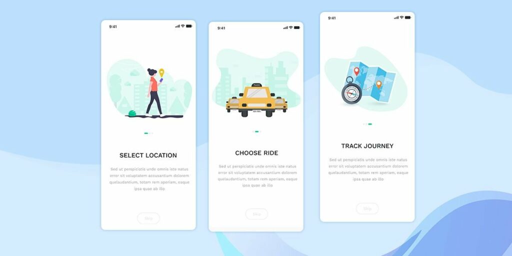
A user’s first touchpoint on a mobile app after their initial download would most likely be the onboarding page. An onboarding process is important as it teaches users key functions, controls, and how to navigate around the app, ensuring a smooth user experience journey. It also sets up proper expectations surrounding the app’s purpose and usage.

The complexity of mobile apps can vary greatly, from single-function apps such as Whatsapp to complex super-apps like Grab or Uber. As such, a proper onboarding process becomes essential to provide the best user onboarding experience, especially for complex apps that may contain different categories of information and a range of functions.

Onboarding screen examples teaching users on how to use the app

Intuitive Navigation

User navigation serves as a key foundation to a good mobile experience as it helps users to be able to fulfill their objectives with the least amount of friction and frustration. This drives the importance of creating a navigational layout that is intuitive and seamless for the user, which can be accomplished through the following considerations.

A. Keeping key functions accessible

Unlike a fixed computer desktop with a mouse and cursor to navigate freely through a screen, mobile devices are usually used through a touch interface, on-to-move while being held in the user’s palm.

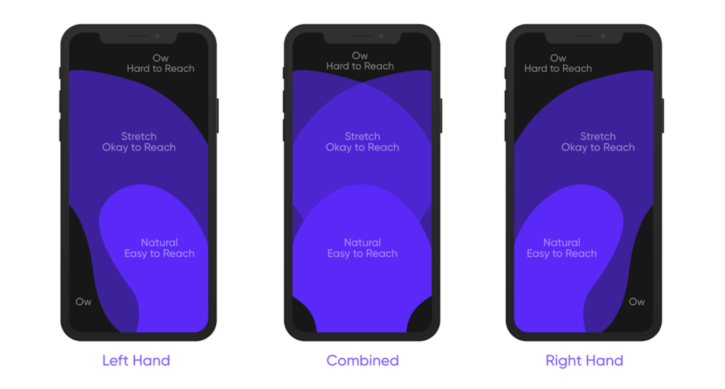
This also means that there may be areas of the screen that are of limited reach since it can be difficult for users to tap at the further edges using their fingers, as depicted in the picture below. Thus, it is important that designers are considerate of this fact and cater to such users by keeping frequently used buttons such as the home, menu, and back buttons, in easy reach.

The picture depicts the extend of a user’s reach on different areas on a mobile screen

B. Providing user feedback

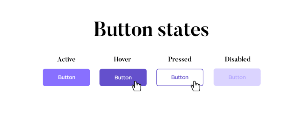
Providing feedback in response to a user’s actions informs them that their input has been registered and that they are on the right track. For example, having a button change to a darker hue once pressed immediately informs the user that their action is successful, without them having to guess or second-check.

C. Using established gestures

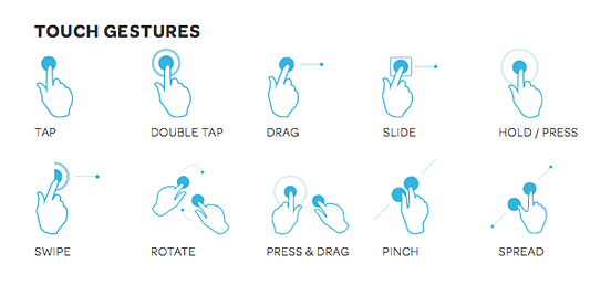
Mobile designers have to consider integrating established user actions such as pinch to zoom or swipe into their designs. These are actions that are already familiar and intuitive to most users and can help them to better navigate and ease into the app. In the case where an uncommon gesture is added to the app, users should be notified either during the onboarding process or when it is initially needed.

Different types of touch gestures

Consistency across platforms

Be it a fixed desktop or a mobile device, a user’s experience across these platforms should be consistent even with interface and layout differences. Design elements such as color, typography, and icons should be kept identical throughout in order to retain the sense of familiarity a user already has with the brand.

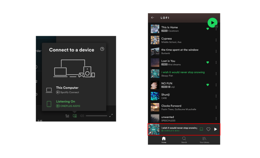
Some brands even allow users to seamlessly transition between their different platforms in real-time. For example, Spotify allows users to log the same account onto both their mobile and desktop app at the same time, with the music playing on the device that the user last clicked on. Having functionality like this becomes increasingly important as more and more users prefer to interact with a brand through multiple platforms.

Spotify provides indicators and controls to support the seamless transition between mobile and desktop usage

Adjust for a mobile screen

When designing for mobile interfaces, it is important to consider the physical limitations of a mobile display, with it being much smaller than that of a full-sized computer screen. Mobile devices are also commonly used outdoors as compared to computers that are mainly used indoors. Thus, there are certain aspects that should be considered.

A. Readability

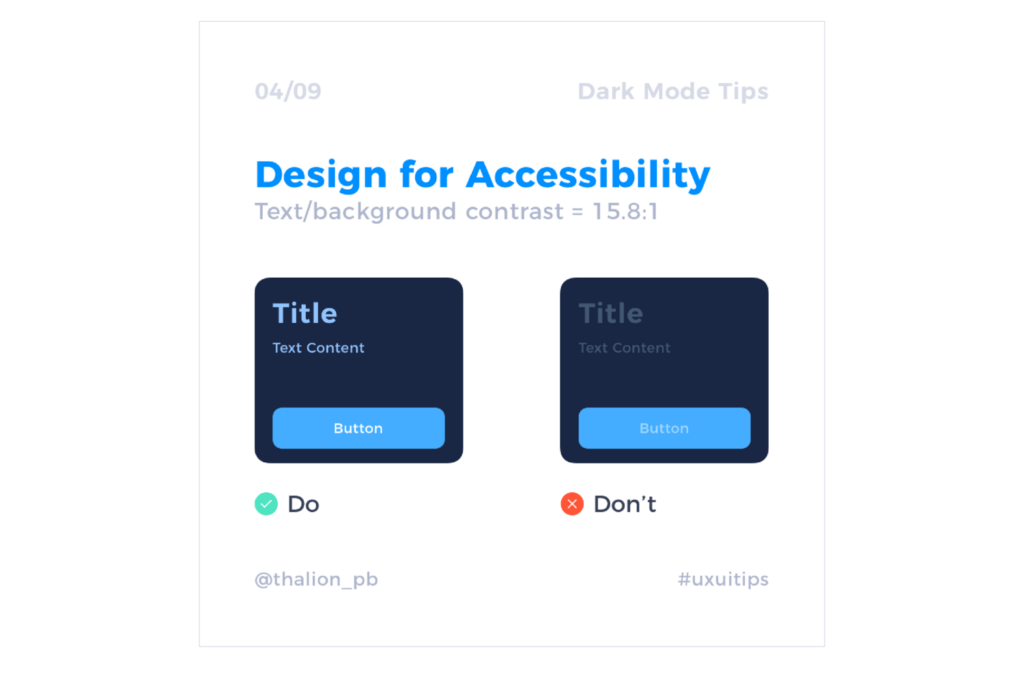
With mobile devices frequently used outdoors while traveling, designers should ensure that the app can be easily viewed under bright sunlight and that the content is clear, even at a glance. It is necessary to establish proper contrast between texts and background for proper visibility under various conditions. With a small screen size, designers have to also strike a fine balance between displaying necessary information and readability, as having too much content makes a page cluttered and difficult to read. Font sizes, title hierarchy, and white spaces are some aspects that should be carefully considered.

Proper contrast between the elements and background plays a key role in overall visibility

B. Segmenting content

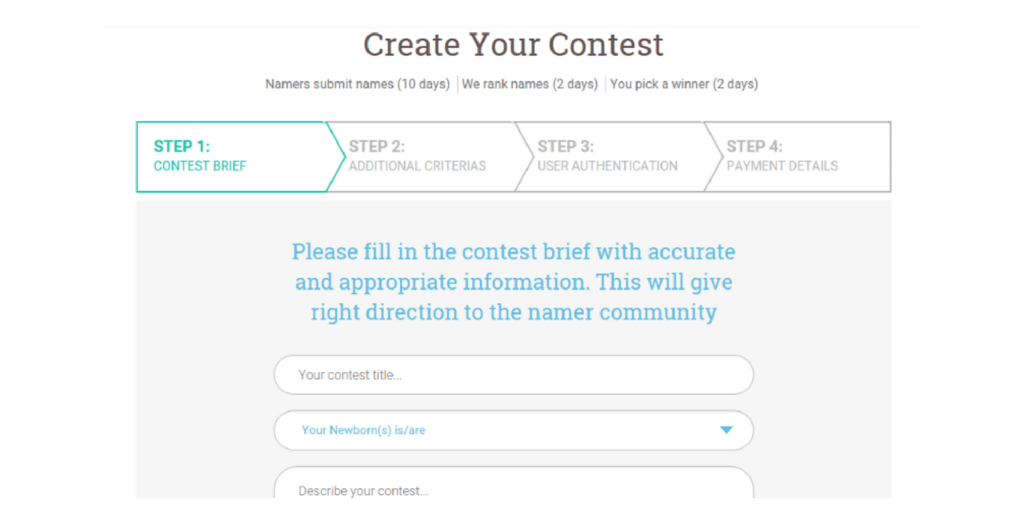
Long scrolling is commonly used for mobile designs as it allows large amounts of content to be displayed on a single page. However, users can become frustrated or disinterested when forced to scroll too much. Instead, designers can break up content or tasks into various screens, with indicators informing users of their progress throughout the process. This not only segments large amounts of content in a more digestible manner, but it also gives users a sense of control, knowing what to expect and their progress.

C. Spacing

The mobile layout should contain sufficient spacing between different sections or texts, as it helps users to better differentiate between different functions while ensuring overall legibility. Avoid squeezing content, or worst, overlap different elements together. This allows users to have an easier time browsing through the app, resulting in a better user experience.

The following example looks at two similar designs, one with the effective use of white space and the other without. It is easy to see the effectiveness of white spaces, even with the content of both designs being identical.

Source: UXplanet

Personalization

Having a certain level of personalisation on mobile apps goes a long way in creating a great mobile user experience. Small details such as remembering a user’s preferences on the app show a level of care and personal touch that digital products tend to miss out on. More advanced personalization like allowing users to set a default home location or creating a saved grocery list for repeat purchases makes the user’s journey much easier, increasing the likelihood of them returning to the app.

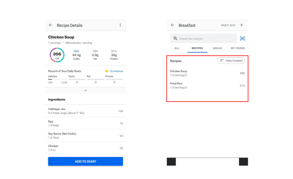
For example, MyFitnessPal allows users to create and save their own recipes, which helps them to conveniently log their own meals during each session without the hassle of adding in the individual ingredients repeatedly.

MyFitnessPal’s recipe function allows users to customise and save their own recipes.

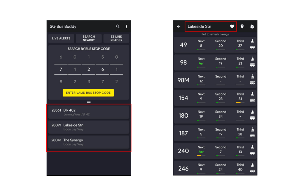
Another example is the SGBusBuddy app which allows users to save their commonly visited bus stops to easily track bus timings without having to constantly key in the bus code.

Left: List of saved bus stops, Right: Button to save a particular bus stop

Identifying user goals

The basis of best UX designs narrows down to how well it can help users to achieve their goals, be it booking a ride or planning an itinerary. Therefore, it is important to clearly identify and cater to the user’s goals for the app on the mobile platform as does not always correlate to their goals on a desktop site.

For example, on a travel mobile app, a user would be more focused on using it to view key details such as checking their daily itinerary and upcoming bookings, as they would likely be using it on the go during their trip. Whereas on a desktop site, users would more likely be using it to plan their itinerary, with a greater emphasis placed on viewing location details or going through the complicated booking processes. Thus, it is important for the designers to consider this difference, adjusting and prioritising features that users need accordingly.

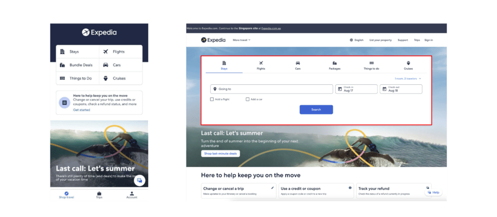
Take a look at Expedia’s mobile app and desktop site. Their desktop site has a heavier emphasis on letting users book or search for specific accommodations, flights on certain dates, whereas the mobile app focuses more on the user’s saved trips and travel promotions.

Expedia’s mobile app vs desktop site

Conclusion

We hope that this article has provided you with a better understanding of the workings behind good interface design for mobile apps, how it can vary from desktop designs and its necessity in the overall customer user experience. Observing real-life examples around us is a great way to learn UX design and we encourage you all to never stop learning and staying curious about the world around you!

Do check out our previous article for insights into good web UX practices! If you want to know more about user experience and its industry, do check out our other resources available on our websites, such as our articles, weekly webinars, and podcasts.

CuriousCore offers both a 2-day UX Design Course and a 4-month UX Career Accelerator for those keen on transitioning into the industry and working on real client projects. Click the buttons below to find out more.