Schedule a call
-

Good Interface Design Principles

In this article

“Form follows function”, as suggested by Louis Sullivan. However, pushing that to the extreme overlooks the fact that aesthetics plays a part in usability. Ultimately, good design is the balance between functionality and aesthetics. Finding the right balance is crucial as it can translate into a smooth customer experience that allows customers to interface with your brand, capture their attention and retain them on your website. Not only is the world increasingly digitalised, but COVID-19 has also made digital interfaces even more central in interactions between businesses and customers. Good interface design is extremely pertinent now, more so than ever.

In UX interface design, the user experience is where you might start, but how the solutions actualise is where you can get creative. There is a plethora of strategies out there but the analogy of a driver might be helpful. Imagine you’re a driver. To get to your destination, you need to be in control of interfaces. To do so, your interfaces need to be intuitive, simple and consistent. The 4 principles below provide a UI design 101 consolidating some best practices for anyone needing a handy guide!

1) Put your user in control

No one enjoys feeling lost. Tools and pathways allowing users to be in control make for a better digital UX design.

Provide clear navigation

Reversible actions: Users should know how they can make a detour should they make a wrong turn on their user experience journey. Be forgiving about “undo” and “back” options. An example would be the option Gmail gives to unsend emails within the first few seconds of sending it out.

Gmail notification upon sending emails

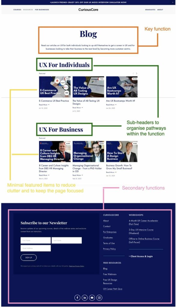
Visual Cues: Every screen should have a primary focus. Make sure your UX design elements are selected based on the main objectives of your pages. Identify your focus. If it is a blog article, your goal might be to enable a user to read and learn. Gear your UX design strategy to achieve the objectives of the page. By that logic, secondary functions of the page, such as shares and additional links, should be given lesser visual weight.

CuriousCore Website’s User Interface Design

Definite pathways: When you are on a highway, you cannot be guessing where your signal switches are! Give users direct information on where the buttons are and where they will lead. Ensure the hierarchy of the pages is indicated clearly: Does a button lead to a sub-page and what category does that page fall under?

CuriousCore Navigation Bar Pathways

Provide user feedback

Communicate to users where they are at: For every action undertaken, a user should receive meaningful responses from the system. Good user experience acknowledges actions taken. If a button is clicked on, simple responses like colour change assure the user that an action has been taken. Prompt communications reduce the anxiety that a user may feel. As a general rule, the following questions are a guide for junctures where responses can be given.

  • Location: Where am I?
  • Status: What is happening?
  • Next steps: What do I do next?
  • Outcomes: What happened?

Know your user: Identifying the target audience of your product is essential in designing effective customer user experiences that resonate with them. Without understanding their pain points, you will never know how to put them in control. What are your users frequently looking for on your interface? How can you create pathways that lead them there? Where could their frustration lie?

“Good user experience acknowledges actions taken.”

2. Interfaces should be intuitive

When driving, you cannot afford to spend time locating where your indicators are—they need to be self-evident. In the same way, good interface design should feel invisible. Users should not feel like they need to expend energy to understand the interface.

Clutter complicates: Don’t provide more information than what your user needs. Be purposeful about the options you are giving users every step of the way. Remove irrelevant elements or content that distract users from what is valuable.

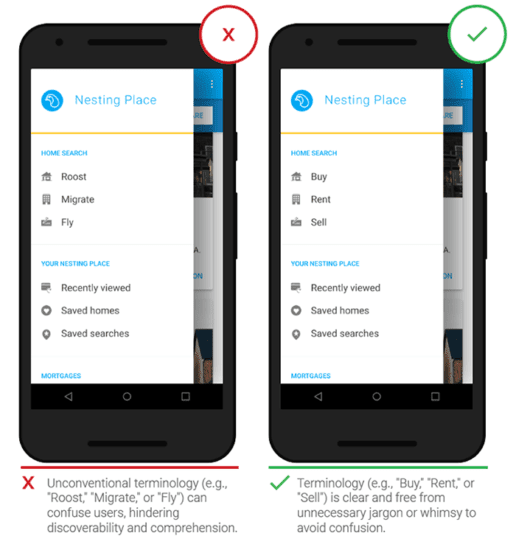
Avoid jargon: Don’t leave your users confused about where buttons lead to. Fancy words might make you feel good but they should never be at the expense of usability. You want to lubricate a user’s wayfinding, not complicate it.

Be accessible: Bear in mind the needs of diverse users. Design for persons with disabilities should not be an afterthought but fully integrated into your design process.

3. Simplicity creates ease of use

While on the road, your GPS does not overload you with the next 5 turns to make but tells you bite-sized information systematically.

Create chunks of information: We retain information in groups. Split up your information so that it is more palatable.

Streamline the number and type of actions: Within 3 clicks, users should find their desired information. The number of gestures available should also be limited. Overwhelming your user with too many available actions can slow down their experience.

Familiar elements: Use symbols and associations that are immediately recognisable. Familiar icons communicate information swiftly and effectively. The hamburger icon, or the three strokes, for instance, is instantly recognisable as a shortcut to the menu of any interface.

Visual clarity: Communicating visually reduces the need to explain through words.

Photo by Pankaj Patel on Unsplash

Utilising a grid system: Systems create an order that makes it easier for users to find information. Instead of inundating your user with information, grids provide structure for navigation.

Organise sections clearly: Pay attention to the information architecture of your interface and make sure the intentions are conveyed clearly. What is the overall structure of your interface? What are the primary, secondary and tertiary navigation options for each screen? Are they visually communicated?

4. Consistency lubricates user experience

It would be confusing to get into a car where the brake is on the right instead of the left! Consistency allows for familiarity and lubricates the user experience. Be predictable.

Visuals: Using the same style for elements within the same product. From icons to fonts, colours and placement, it should be similar across devices. Follow brand guides to seal your brand story. Apart from that, make sure to tap on familiar visual conventions. For example, it might be disorientating if the “Submit” button turns red instead of green when hovered over.

Behaviours: How controls respond should not vary in the same product and should be consistent across all devices. Users should never be caught by surprise!

Conclusion

In an age where attention span is dwindling, a memorable user experience can allow you to cut through the noise and make your brand stick. Ultimately, the goal is to make the user interface design invisible; it should feel like second nature for your user. In creative UI design, be a designer that puts others in control of interfaces by creating intuitive, simple and consistent designs. Making your users feel in control can go a long way in consolidating how memorable your brand is!

We hope that this article has provided you with better insight into user interface design best practices and recent UI UX design trends 2021. If you want to know more about user experience and its industry, do check out our other resources available on our website, such as our articles, weekly webinars, and podcasts.

CuriousCore offers both a 2-day UX Design Course and a 4-month UX Career Accelerator for those keen on transitioning into the industry. Click the buttons below to find out more.