Schedule a call
-

Differences between designing for mobile and web

In this article

More than ever, the market is saturated with businesses. Against that backdrop, websites and mobile apps have become important touchpoints for brand messaging. Appealing yet functional websites and apps that deliver the best user experience can make or break users’ impressions of the business.

However, web and mobile share different attributes, and therefore, require different considerations. Having a thorough understanding of the platforms, functions and user behaviour is the key to designing effective UI/UX experiences.

Here are some key areas of differences that you should take note of when designing for each of the platforms:

1. Expectations/Purpose

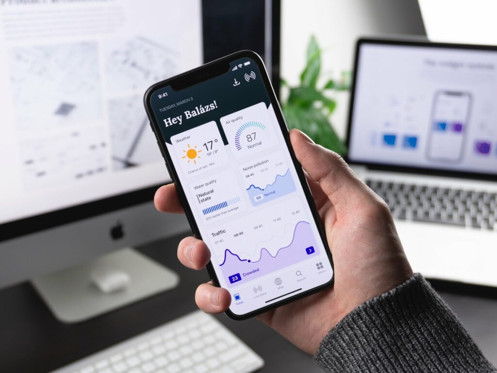
The web is commonly designed for information, and it follows that it is used for searching and accessing information. Users also normally do such research while sitting down. While mobile devices are also used for researching, users would want to acquire the desired information quickly as mobile devices are frequently used on the go. This would also mean that mobile users have a shorter attention span and little time as compared to those using the web, and can be easily distracted. On top of that, mobile provides users with the ease of doing things on the move, and therefore many mobile platforms look at accomplishing tasks as well. With this in mind, navigation on mobile should be straightforward to follow. Content should be well-written, structured and visually prioritised to fit the needs of its users. Information should be easily accessible on mobile UX design. Essential information, such as the location or phone number of a business, should be prioritised. In essence, mobile platforms should be easy to use and kept simple, so that users can use them on the go. On the other hand, content such as articles and blogs should remain accessible for mobile users, as this allows them to read through more information should they have the time.

2. Screen sizes

Mobile devices have smaller screen sizes, while desktop screens are much wider and allow users to navigate with a mouse and keyboard. This is another consideration that should be kept in mind when designing for the web and mobile. Mobile apps should utilise touch functions, as opposed to clicking (like the desktop), and make sure that the buttons are big enough. The location of the touch buttons can also make a big difference in how accessible the mobile platform is. On top of that, designers should make it easy for mobile users to read their content through concise and clear content title and copy, and ensure that the typography and font size is intelligible for the users. The content should also be organised vertically to fit the smaller screen size. Having a built-in dictionary and power-saving options can optimise users’ experience on the mobile too.On a similar note, another area to consider is form-filling. It is tedious for mobile users to scroll back and forth while filling out a form. Making the form fields align vertically can address this issue. Predictive text would also be useful for fields with many potential responses. This allows users to fill in the form quickly and reduce typing errors. Minimising the number of fields would also ease the form-filling process for the users. As such, only ask for absolutely necessary information. You can also condense multiple fields into one.Finally, the screen size also affects how the menu of a page is displayed. It is convenient for users to look at a menu with many categories and sub-categories, but the opposite is true for mobile users. Consider single-level menus and vertical alignments should the menu have many options. Additionally, menus can be made to collapse and then expand when the user narrows in on one category.

3. Content

Browsing behaviour is different on mobile and the web. As such, mobile pages should prioritise the essential information and include collapsible menus and widgets. Clear and concise content should be the top consideration, rather than the introduction of additional features and UI elements. Additionally, create the right flow on the mobile page to guide the users when using it. Users should be able to understand how to navigate the mobile platform and get to the content they want. On the other hand, web versions can include higher-fidelity visual elements, more whitespace, and can accommodate full-size imagery like ads and promotional materials. A larger screen size would mean that content can stretch across the screen and multiple messages or images can be included.

4. Phone features

Mobile users want a sense of familiarity and consistency across the different mobile platforms. This can be done by integrating phone features into the mobile platforms.As such, learn the standard UX elements for the different mobile operating systems, and use them as a reference for the app design. This allows the users to easily navigate the app as well. Another feature of mobile phones is the ability to make calls and send text messages. Apps making use of such mobile functions are likely to give a better experience. The user’s geographical location can also be used in apps to send geographically-targeted push notifications.

5. Technology

Another consideration is the difference between mobile web applications and native applications.

With mobile web applications, it is easy to update and do version control without approvals. They also possess a single codebase and are easier to maintain. All in all, they are great for short-term campaigns. However, they are limited in terms of specific functionality although they may be able to access cameras and microphones. Finally, how smooth the experience depends on the internet connection.

Native applications are usually listed on the app store and can use phone features such as gyroscope and GPS. It is also a faster experience due to content assets being stored on the phone. However, any update and version control require approval from Apple and Android. They are also more costly to maintain due to the separate codebase for iOS and Android, as well as the two development teams. As a result, native applications are recommended only if businesses are willing to maintain it for at least a year.

Conclusion

Web and mobile each serve different purposes. Delivering a smooth UI/UX experience requires understanding users and what they expect from each platform. Bear in mind that users would want to be able to access the same content and information on both the web and mobile, which requires looking at UX fundamentals. However, each platform should organise its content differently to ensure users’ satisfaction. In essence, mobile features can zero in on interaction design, while web features can focus on information architecture.

Apart from designing each of the platforms separately, another approach is the mobile-first design, which is to first design the mobile interface before expanding the features to a desktop or tablet. This ensures a responsive UX regardless of the platform and encourages engagement and retention of users. In a fast-paced world with fierce competition, a good interface design can mean an added edge for businesses.