Schedule a call
-

Best UX Landing Pages and What We Can Learn

In this article

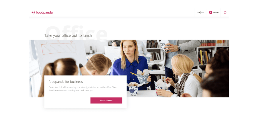
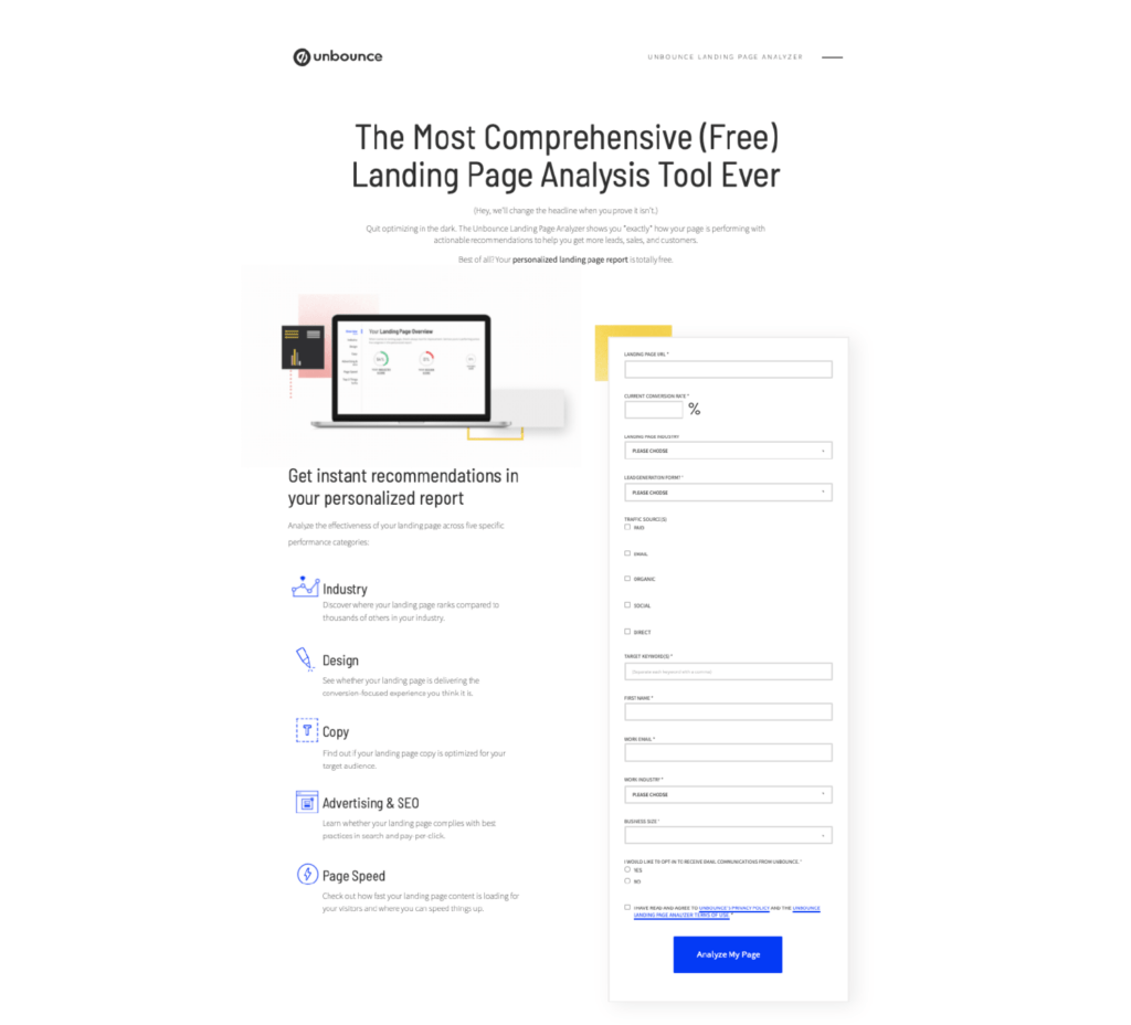
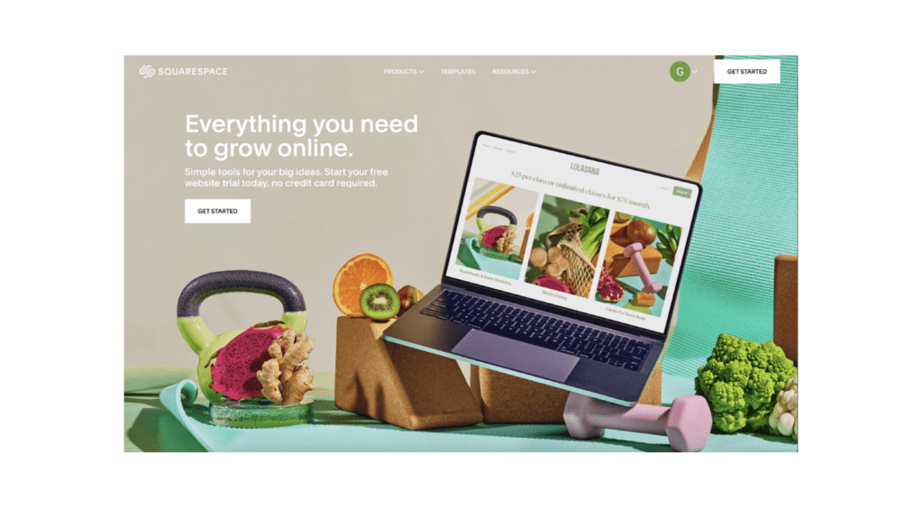
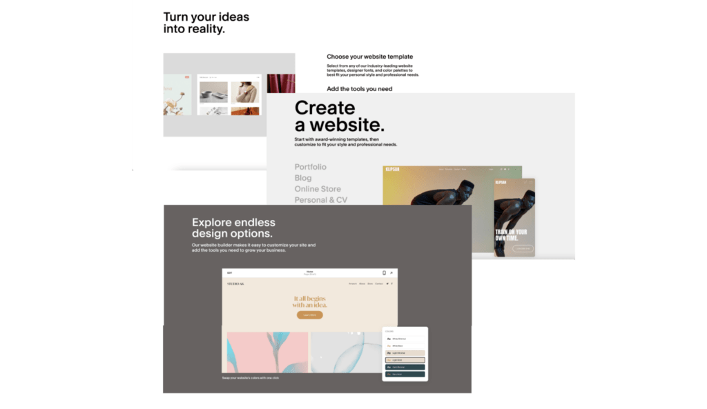
The main goal of an online campaign or website of a business is to drive action from their audiences, be it to purchase a product or to use a service. Landing pages are an essential part of that process as it acts as the online face of the brand, it is the first thing the audience interacts with when heading onto a website and its ability to engage with them determines whether they will choose to continue browsing. Thus, a good user experience (UX) is necessary to create effective and high converting landing pages.

In this article, I will be touching on the key aspects of the Best UX Landing Pages and how to craft one, as well as look through some landing page samples with good interface design and talk about what exactly makes them stand out.

Importance of a good landing page

A study by the Nielsen Norman Group has shown that the first 10 seconds of an audience’s experience on a webpage is crucial to determine if they stay or leave. There is a high possibility that the person would leave if they are not engaged or are skeptical about the landing page. Having quality content or exemplary products would be irrelevant if the audience fails to look beyond the first page.

Having a clear and engaging landing page can be the factor that pushes the audience to take the next step as a potential customer, by either browsing for more information or sign up with their details.

Apart from engaging audiences to make them stay on the site, the landing page is also important in driving conversions, with the conversion rate for landing pages in businesses averaging at 26%, and even going as high as 40%, as statistics from Databox show.

Now that you understand the importance and value a good landing page can bring, what makes a good landing page and how do you create one that is relevant and engaging? Here are a few key aspects and landing page ideas to note.

Source: Databox

Landing page UX best practices

A. Clear and concise copy

A clear and concise copy in landing pages allows a business to deliver their unique value proposition to their target audience more effectively as it sets up clear expectations on what they can hope to achieve. It has been shown that 29.5% of landing pages contain too much copy as business sector pages containing less than 100 words have shown to work 50% better than pages with 500 words or more. To stand out amongst competitors, a copy needs to drive a strong message on what the business is about and how it can help the user.

Source: Unbounce

B. Optimised for the customer’s journey

A business has to consider where their landing page lies in their customer’s journey. Is the landing page the start of the customer’s online interaction with the brand or are they led to it through an app or marketing campaign? What are the main things that potential customers would want to know about the business at this stage?

A distinct call to action button after the copy makes it easy for the audience to proceed to the next step of the customer’s journey, as it saves them the hassle and time needed to look for where to click. Having a navigation menu bar also helps in this aspect as it provides a clear overview of the website, providing easy access to the rest of the content.

These elements ensure that friction is minimised throughout the customer’s journey by keeping audiences clear on where they are on the webpage, what their next step should be, and where to take action. This can ultimately lead to a longer time spent on the website and an increase in conversion rate.

Source: dribbble

C. Purposeful landing page UI

Similar to a marketing poster or a social post, the visuals of a landing page should match well with the brand’s identity and is easy on the eyes. Elements such as colors, texts, and graphics should be considered carefully as having excessive content can distract and confuse audiences. For example, colors for buttons and texts serve as important visual cues to tell the audience what to read and where to click.

Source: GoSquared

Besides communicating a message, visuals are also essential to setting the right tone and mood for the business. For example, a hero image helps audiences to visualise and understand the brand’s value proposition and better contextualise how the business can help them. These are all elements that contribute to the landing page UI which is key in ensuring a good UX.

Source: foodpanda

Best UX landing pages examples

GRABFOOD

Grabfood’s landing page is simple and straightforward, its main aim is to convey the message of helping their users get good food. The page features three key aspects, a picture of the food, the copy, and a call-to-action button. Simple home, login, and cart buttons are also displayed at the top for users to have the ability to navigate to other parts of the page.

The copy is well-written in the sense that it speaks directly to the users, with phrases like “good morning” and “let’s explore”. Placing a location input function above the call-to-action button helps to minimise friction for users as they can easily input their location details without leaving the landing page. Promotions are also featured at the bottom to entice users with relevant and attractive deals.

Source: GrabFood

UNBOUNCE

Unbounce’s landing page UX strikes a good balance of being detailed while also concise enough for audiences to easily read. The use of white space and short, segmented paragraphs easily directs readers to different areas of the page. An engaging copy allows audiences to understand the brand’s value proposition from the get-go, which is to help them “get more leads, sales, and customers”.

The picture chosen serves well to complement the copy and the brand’s services as it gives audiences a glimpse into what their digital tool looks and feels like. Towards the lower end of the page, icons are paired with texts to further emphasize the various functionality of the product. Icons and colors are kept visually consistent throughout to ensure a smooth reading experience.

A personalized report form is also provided directly on the page, allowing potential customers to input their details to receive a free report. Having the form here minimizes friction as it reduces the number of pages the customer has to click through to take action, which helps in driving conversion on the page.

Source: unbounce

MYREPUBLIC

MyRepublic makes good use of visual hierarchy through colors and text sizes to direct audiences to their message. Call-to-action buttons are also prominently displayed with a strong contrasting color to ensure that they stand out to audiences. The “Learn more” text on the buttons informs readers that they can head to other pages for more information about the product.

Another strong aspect of MyRepublic’s design is how it complements well with its wide array of product offerings, through the use of scrollable banners at the top of the page. The audience’s flexibility to scroll through the different sets of copy and images allows the brand to reach out to different target audiences while maintaining a clean and concise landing page.

The webpage also features 2 sets of navigation bars, one based on their target audiences and the other based on their product offerings, for audiences to better navigate the website based on their needs.

Source: MyRepublic

SQUARESPACE

Squarespace’s landing page is clear, clean, and easy to read. Similar to previous examples, the page also features an engaging copy, relevant hero image, and a call-to-action button.

The webpage aims at helping readers visualise the ease with which they can build their own website by having pictures of their website builder, template designs, and simple instructions on how to start. The use of words such as “makes it easy to customise” and “simple tools for your big ideas” serves to emphasize the simplicity of creating a webpage with their application, even for those inexperienced in web development.

The well-thought web design and copy manage to address the needs of their target audiences effectively while educating them on its digital product.

Source: Squarespace

LYFT

Lyft’s minimalist approach to their landing page makes it simple and clear to their readers. The webpage features two hero images, a driver and a passenger, with two distinct call-to-action buttons to differentiate between their different target audiences. A location search bar placed at the top allows users to easily enter a location and book a ride from their landing page.

Their design approach to minimise content is effective in reducing friction and providing a more streamlined and pleasant user experience.

Source: Lyft

I hope that this article has helped you to better understand what goes on behind some of the great landing pages that we look at every day. I also hope that this article is useful in helping you learn more about designing with a user-centric approach, in addition to providing you with better landing page ideas that you can use.

Aside from landing pages, a user-centric mindset can also be applied in many other situations for both creating a better user experience, and driving key results. If you want to know more about user experience and its industry, do check out our other resources available on our website or have a look at our UX design course.